logo design
Any company or business benefit from a strong logo. However, even successful companies with established logos may need to revisit their designs. The Shell logo, for example, has evolved over time to stay fresh and reflect changes in design aesthetics.
Well-designed logos, whether primarily for printed publications or used in web design, should provide flexibility for all the different types of media used today and should be clear and reproduce well whether on a letterhead or a 10-foot banner.
Ideally, logos must be clear and easy to recognize, print well in colour and in shades of gray, offer lasting value, and scale well (i.e. look the same large or small, in print and on the web).
If the logo design accommodates these demands, your logo will serve you well and will be a cornerstone in your business.

The Shell logo, 1933 & 1955 & 1995
The American Airlines logo, 1968 & 2013
logo design samples
Holy Spirit Anglican Church
In 2021, Holy Spirit Anglican Church, Ruskin, BC, is celebrating its 100th anniversary. For the occasion, A commemorative logo was commissioned as part of new initiatives for increased visibility and new branding.
The logo is a direct depiction of the church steeple of this historical building, a landmark in the local area.
GREAT DANE design, 2020
ESA - iriss
In April of 2014, a competition was launched to design the logo for the European Space Agency 2015 mission iriss to the International Space Station. Among more than 120 submissions, my logo was named the winner and revealed at an international press conference in Copenhagen on October 10, 2014.
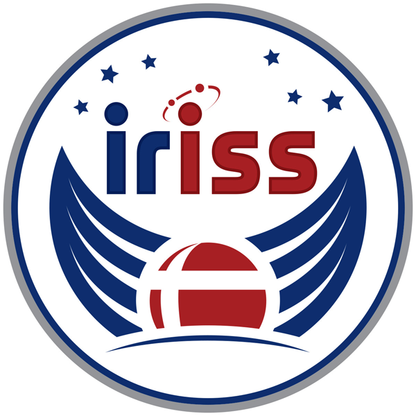
The logo is inspired by the Greek goddess Iris who is often pictured with wings. At the same time, the wings in the logo symbolizes a Viking ship which represents the urge to explore and move towards unknown horizons. The astronaut’s Danish nationality is represented by the Danish flag in the globe and the red and white colours. The name of the mission, iriss, is written in two colours in order to underline that the destination for the mission is the International Space Station, known as ISS. Above the name are planets in orbit and stars.
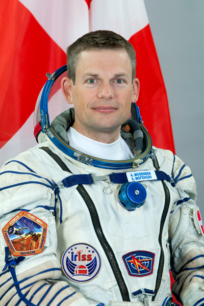
Andreas Mogensen, wearing the official mission logo
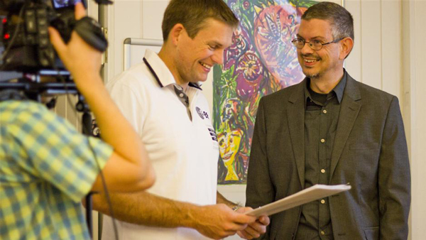
Andreas Mogensen and Poul Rasmussen at the press conference where the logo was reveiled
Below a two-minute animation about the development.
There is more information about my logo on the following websites:
ESA (English)
ESA & iriss logo (English)
Danish Ministry of Higher Education & Science (English)
Associazione ISAA & Astronautinews (Italian)
Danish Broadcasting Corporation & Science (Danish)
GREAT DANE design, 2014
CSR Investigations Inc.
CSR Investigations Inc. is a company that does investigations for legal, insurance and corporate clients.
It was a request the primary colour being gold and two versions were created for variation. The logo is to be used mainly on a black background, such as website, business card and brochure.

GREAT DANE design, 2011
Nautilus CAE & CAD
Nautilus CAE & CAD is a mechanical engineering company, specializing in industries such as aerospace, fuel cells, alternative energy, and automotive.
The actual name of the company is flowing from the opening of the shell. Underneath the abbreviations "CAE" (computer-aided engineering) and "CAD" (computer-aided design).
GREAT DANE design, 2009
Mainland Athletics
Mainland Athletics is a soccer academy for younger children.
The logo depicts a soccer player bursting out of a star, symbolizing that the academy is "producing stars."
GREAT DANE design, 2013
